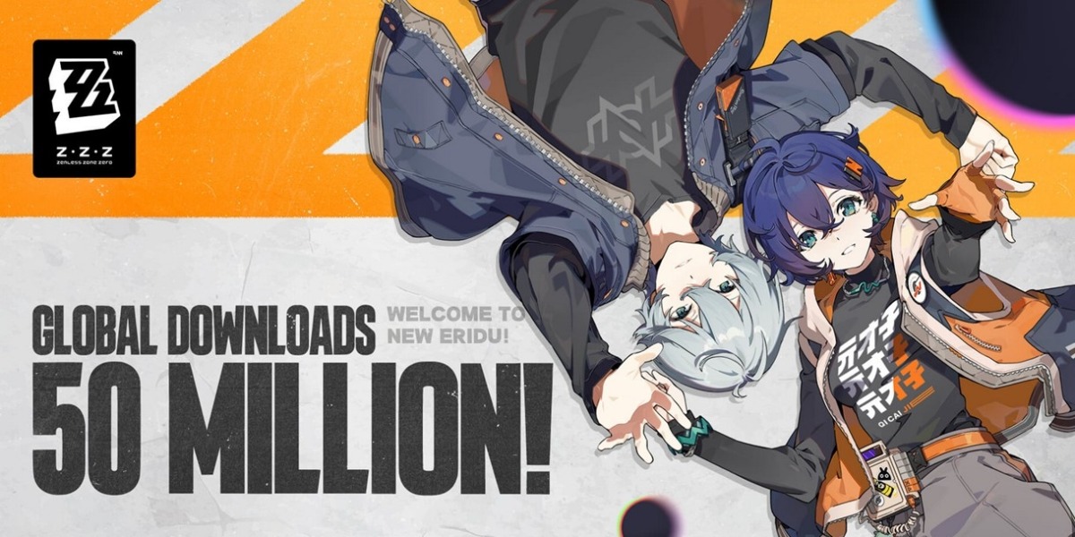
I’m not surprised that it’s lagging behind the other 2. To me, it feels like Honkai Impact 3rd with a coat of Persona 5 paint on it. Everything is flashy and tries to seem complicated, but it’s dead simple so far. I imagine there’s some actual strategy to the combat later, but at lower levels, it’s painfully lame.
And the writing? Wordy as ever, and so pointless. Skipping through the text quickly makes you miss like 1/3 of it, even if you read super fast. It literally just never shows on the screen, hidden behind some scrolling text area or just not even put onscreen before advancing.
The weapons are all just balls with faces. They seem like children’s toys instead of useful items, and it’s hard to care about them beyond the stats.
I’m impressed they made even that $25 mil.
The only thing that has drawn me in so far is the daily video store thing, and I just thought to myself this morning: “Shouldn’t I just find a good store game instead?”
For me the combat is flashy enough to feel cool, but far too fast and far too simple.
Though honestly what burned me was just how bad the starting characters feel (automatically moving backwards is really annoying when there’s stage hazards to dodge) in combination with the slow gaining of new ones and exactly the same resource and upgrade systems as the other games.
wordy
Does it sound like GPT?
I don’t think so. It’s a pretty common style for things that are flashy but have no substance, especially video games. I don’t mind it much when I can quickly skip through it and speed-read it, but when it forces you to slow down (Genshin, Star Rail) or never shows part of the sentence if you’re going fast (ZZZ) then it makes the cutscenes almost intolerable.


