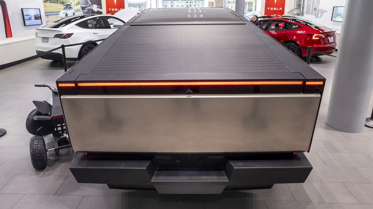
The Cybertruck Is a Disappointment Even to Cybertruck Superfans / Looking at the specs alone, the car is delivering 30 percent less range than expected for 30 percent more money::Looking at the specs alone, the car is delivering 30 percent less range than expected for 30 percent more money.


Why is this thing so goddamn ugly? It’s like the designers took all the worst sci-fi vehicles from movies and smushed them into one.
I was having this same conversation the other day. Have you ever seen that picture where different people involved in the creation of the video game Kirby draw the title character? Two look really good, and the rest are awkward blobs that only look like Kirby because of the power of suggestion.
Anyway, I genuinely think a team of Tesla employees (independent of Musk) were talking about building a truck, and all took turns drawing something while pulling together numbers before the pitch to Musk. As a joke, the design team mocked up the worst sketch in 3D, and Musk accidentally saw the design in the Slack chat history and demanded it.
Either that, or some sort of “have your kid draw the next Tesla” employee contest, and the design teams modeled the funniest ones as actual cars for the company newsletter. Like those companies that’ll turn your kid’s drawings into real life stuffed toys.
I think Elon might have wanted to design a car himself so he came up with this or something
Removed by mod
It’s what people thought modernity would look like back in the 70’s and 80’s - all function and no form
Removed by mod
It looks like something from a bad 1980s post-apocalyptic movie.
I asked ChatGPT who designed this thing, and I think this makes it clear why it’s so ugly (bold added by me):